Build Your Own Design Tools

Until recently, creating a design meant learning how to use tools like Photoshop or Figma. Today, you no longer need to know these tools to create a design. That has already changed.
When I first asked myself if I needed any new design tools, nothing came to mind. It seemed like I didn’t. But that was just my first impression.
Small tools, new ideas
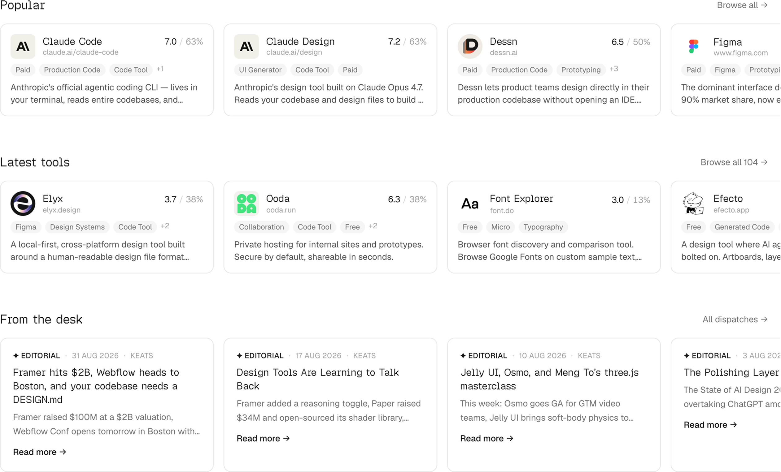
The first site I want to share is designtools.fyi. It has a large collection of design tools, with more being added.
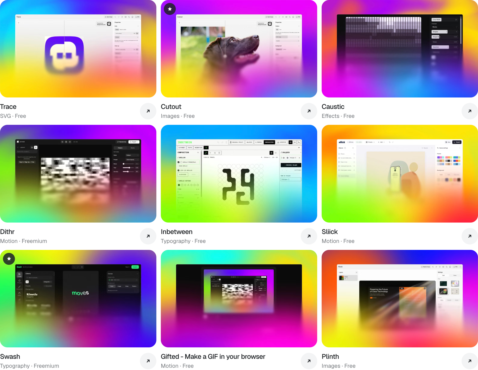
Another site is www.designminis.com. It focuses on small tools made by designers, each built for a specific task. You can find tools for picking colours, creating shadows, adjusting animation curves, and more.
Kazam
Prototyping can lead to unexpected results. Kazam by Near Future is one example. It gives the small design tools you build with AI a shared home, running locally in your browser with no account or subscription.
You can ask AI to build a pattern generator or a custom effect, add it to your collection, and share it with a colleague. A personal toolkit for the things you need. Link with more details github.com/near-future-works/kazam.
AI aha moment
AI stops feeling abstract when you see that you can use it to build your own tools and solve real problems. That is when its value becomes clear.
You can build your own mockup generator, a tool for collecting feedback on visuals, or an automation for creating icons. Each one can fit your taste and the way you work.
Once I understood this, ideas started coming to mind. For example, a small AI branding tool where you set your colours and fonts, then generate patterns and other brand assets. The point is that you can build it yourself, around your own needs.
Another idea is to build a tool that uses your first brand book as a template, so you can automate the process of creating new ones that follow your structure, style, and rules. ChatGPT or Claude will not automatically know how you want a brand book to look and work. You need to define that and use AI to build a tool that follows your approach.
When we talk about how AI is changing design, we mean more than tools like ChatGPT. We mean the ability for any company, studio, or agency to build its own tools, small or large, around its needs. To actually write the code and make them work.
Brand Mockup Generator
The first tool I decided to build was a mockup generator. Plenty of paid options exist, but I wanted one that fits my needs. And, of course, it will be free to use, with no subscription required.
The idea is simple. I enter my brand colour in RGB, upload a logo, and apply them to 3D objects like credit cards, flags, or mugs. Then I adjust the settings and download an image. That was the idea I chose to start with.
Plan Mode is your friend
Before building, use Plan Mode in Claude Code to work through your idea. It reviews the project, asks questions, and suggests a plan without changing the code. You refine the plan, then let it build. This is especially useful when you are still figuring out what you want.
Start with the browser
A design team can build its own tools as a simple website, even a single index.html file, and host it wherever it wants. Or it could build a Figma plugin. There are plenty of options.
I wanted to start with something simple: a tool that runs in the browser. Here is how I built it.
From idea to brief
I created a project in the chat and started with a rough idea. Then we worked through it over several rounds. The chat asked questions, I answered, and we added settings and details. It took time to turn that idea into a clear concept for the tool I wanted.
Once the concept was ready, I asked the chat to turn it into a prompt for Claude Code to build it. This was my first concept for a beta version. Here is the full prompt.
1. Input. The user uploads one PNG logo, preferably white with a transparent background, and supplies one non-white brand color through RGB inputs or a synchronized color picker. Do not require fonts, a brand name, or a whole brand kit. Preserve the uploaded logo’s original colors and proportions. Optional text is an advanced feature.
2. Output. Create 12 photorealistic branded product scenes: bank-style card, takeaway coffee cup, flag on a flagpole, desk flag, membership/access card, badge with lanyard, envelope, T-shirt, cap, fabric tote bag, ceramic mug, and aluminum can. These must be interactive 3D scenes with adjustable camera angles and product-specific controls.
3. Format. A desktop-first browser web application with one main page. Keep the interface accessible through an index.html entry point. Separate model, texture, and JavaScript files are allowed and preferred over an enormous self-contained HTML file. No backend or account system is required.
4. Export. Download a landscape 16:9 PNG of the scene, excluding the editor interface. Support 1920 × 1080 and 3840 × 2160 where the device supports it. No PDF, SVG, shareable links, or transparent-background export in the first version.
5. AI. Runtime AI is not required. Do not generate or modify the user’s logo with AI. Use real 3D geometry, physically based materials, prepared product models, and controlled deformations. AI-generated flat images must not replace the interactive objects.
6. Stack. Choose a maintainable stack suitable for high-quality browser 3D rendering. A reasonable default is Vite, TypeScript, Three.js, and a lightweight UI layer. React is optional. Use actual 3D rendering rather than CSS perspective tricks. You may initialize a local Git repository if one does not exist. Do not publish or deploy without an explicit request.
Build the application described below. Treat this as an implementation request, not a request for another proposal.
# Product: Mockups Generator
## Goal
Create a polished browser tool that turns one uploaded logo and one brand color into portfolio-ready product mockups.
The user selects one product at a time, adjusts its composition and surface treatment, and downloads a photorealistic image.
The visual ambition is premium product photography: restrained compositions, convincing materials, precise details, soft directional lighting, and beautiful shadows. Apple product imagery and product presentations are art-direction references.Kiselev.global is an example of the type of portfolio where the exported images could appear.
Do not copy proprietary assets or claim to match these references without visually inspecting the result. Translate the references into concrete material, lighting, and composition decisions.
The full first-version scope includes all 12 products. Implement them in stages, but do not silently reduce the deliverable to three products.
## Working approach
Inspect the project and applicable repository instructions first. Reuse existing infrastructure when appropriate.
Make routine implementation decisions autonomously. Ask only about genuine blockers that cannot reasonably be resolved from this specification.
Build and run the application, inspect it in a browser, exercise the controls, and inspect exported images. Do not stop after writing scaffolding or presenting a plan.
If an asset, permission, or capability blocks a feature, explain the specific limitation. Do not present a placeholder as a finished photorealistic product.
# Brand rules
## One user-selected color
Provide:
- R, G, and B numeric inputs, each constrained to 0–255.
- A synchronized color picker.
- An optional synchronized HEX field for convenience.
Only one brand color is user-editable.
Reject pure white as the brand color. Recommend a sufficiently distinct colored tone, but do not arbitrarily reject other valid colors.
Use this helper text:
“Choose a non-white brand color and upload a white PNG logo with a transparent background.”
Apply the brand color to the main body of the selected product. Related painted or fabric details should generally use the same color: cup lid, tote handles, lanyard, and similar parts.
Preserve appropriate natural materials for construction details such as metal fasteners, flagpoles, card chips, and the top and bottom of an aluminum can.
Treat the selected RGB value as the material’s base color. Lighting and shadows must naturally affect its rendered appearance. Manage color spaces correctly.
## Logo
Accept PNG uploads with transparency.
Preserve:
- Original colors.
- Alpha transparency.
- Original aspect ratio.
- Original artwork.
Do not automatically recolor, redraw, stretch, crop away visible artwork, or replace the logo.
A white transparent logo is recommended, but colored logos must also remain usable.
Render the logo as part of the product surface. It must:
- Follow the surface’s perspective and curvature.
- Follow cloth deformations.
- Receive appropriate lighting and shading.
- Be occluded by the product when out of view.
- Avoid floating, flickering, and z-fighting.
Use correctly prepared UVs, composited material textures, or another surface-aware method appropriate to each product. A screen-space overlay is not acceptable.
Calculate placement using visible alpha bounds where useful so transparent padding does not make the logo unexpectedly tiny. Preserve the visible artwork.
Provide per-product print regions with safe placement limits. Logos must not accidentally spill onto handles, edges, unrelated faces, or hardware.
For double-sided products, apply the logo to the selected side only unless a separate repeat option is enabled.
Warn helpfully when the source logo is too small for a sharp export. Do not claim to recover missing detail.
## Background
Provide two studio modes:
1. Brand studio: backdrop and floor use the brand color.
2. Light studio: a fixed neutral light backdrop and floor.
Do not expose a second custom color picker.
Separate the product from a same-color background through lighting, material response, and shadows.
The outdoor flag uses a sky background instead.
# Interface
Create a refined, quiet editor with the image as the main focus.
Layout:
- Left: a product library with thumbnails and names.
- Center: a large 16:9 scene preview.
- Right: contextual controls.
- Top: application name, reset controls, and Download PNG.
Use a neutral interface so the editor itself does not interfere with judging the brand color.
Organize the right panel into:
- Brand.
- Composition.
- Logo.
- Product.
- Lighting.
- Additional design.
Use understandable labels, sliders with numeric values, and compact toggles. Hide irrelevant controls when switching products.
The preview must clearly show the exact export boundaries.
Allow direct pointer rotation of the product or camera, with synchronized controls. Avoid conflicting drag behaviors. Provide an obvious way to return to the default composition.
Maintain:
- Shared uploaded logo and brand color across all products.
- Independent scene settings for each product.
- Previous product settings when switching away and back during the session.
Start with a polished bank-card demonstration and clearly identified demo artwork. Do not invent the actual Belfast Design logo. The user will supply their real logo.
Provide helpful loading, upload-error, unsupported-renderer, and export-error states.
Do not include dead buttons or controls that have no visible effect.
# Shared controls
Provide suitable ranges for:
- Horizontal rotation.
- Vertical tilt.
- Roll.
- Product scale within the composition.
- Horizontal and vertical position.
- Perspective strength.
- Logo scale.
- Logo horizontal and vertical placement.
- Logo surface rotation.
- Light direction.
- Light intensity.
- Shadow softness.
Changing perspective should preserve reasonably consistent framing.
Use controls appropriate to the selected product rather than forcing identical controls onto every model.
Provide two or three curated compositions per product, such as front view, three-quarter view, and close-up. Use physically sensible presets for that product.
Include:
- Reset composition.
- Reset selected product.
Do not automatically spin objects or run decorative animations. The scene remains still unless the user changes something.
# Product collection
Keep this exact order.
## 1. Bank-style card
A thin, realistically proportioned plastic card with rounded corners and a visible edge.
Default:
- Brand-colored matte plastic.
- Small logo with generous margins.
- Restrained three-quarter angle.
- Soft shadow.
Controls:
- Matte or satin finish.
- Surface gloss.
- Chip on/off.
- Front/back print side.
- Optional short text or fictional card details.
Do not add payment-network marks or another company’s branding.
## 2. Takeaway coffee cup
A realistic tapered paper cup with a rim, base, and removable lid.
The cup body and lid use the brand color. The logo wraps correctly around the tapered surface.
Controls:
- Short, standard, or tall proportions.
- Lid on/off.
- Logo position around the cup.
- Paper texture strength.
- Lid gloss.
Default: standing on a studio surface, viewed slightly from above.
## 3. Flag on a flagpole
A rectangular fabric flag attached plausibly to a metal pole against a sky.
The flag is brand-colored. Its logo is part of the cloth material.
Controls:
- Wave amplitude.
- Wave size.
- Static wave phase, labeled “Fold position.”
- Fabric sag.
- Cloth direction.
- Framing: focus on the flag or show the complete pole.
- Clear sky or light clouds.
- Sun direction.
Keep the attachment edge secured to the pole while deforming the free cloth.
Use plausible cloth thickness, normals, and restrained light transmission. The reverse should show a physically plausible mirrored print.
All controls change a static shape. There is no playback, automatic waving, or pause button.
Ensure shadow and lighting calculations follow the deformed geometry.
## 4. Desk flag
A small fabric flag on a metal desk stand, shown in the studio.
Controls:
- Fabric sag.
- Fold strength.
- Flag angle relative to the stand.
- Round or square base.
- Light or dark metal stand.
Default: a three-quarter composition showing both cloth and base.
## 5. Membership/access card
A colored plastic card with room for optional identifying text.
Controls:
- Horizontal or vertical layout.
- Matte or satin finish.
- Attachment slot on/off.
- Optional name, title, or membership number.
- Front/back print side.
Default: logo only, with no mandatory fictional details.
## 6. Badge with lanyard
A colored badge with a textile lanyard and realistic metal attachment.
Controls:
- Horizontal or vertical badge.
- Visible lanyard length.
- Lanyard spread.
- Lanyard curvature.
- Badge angle relative to the lanyard.
- Repeat logo on lanyard on/off.
- Optional name, role, or event name.
Use controlled deformations or prepared poses. Keep the clasp connected and prevent obvious intersections.
## 7. Branded envelope
A colored paper envelope with thickness, folds, and a functional-looking flap.
Controls:
- Front/back view.
- Flap opening.
- Standard or elongated proportions.
- Smooth or textured paper.
- Optional short text.
When printing on the back, use the flap as the default logo region.
The flap must pivot around its actual fold.
## 8. T-shirt
A solid-color cotton T-shirt without a person or visible mannequin.
Controls:
- Front/back print side.
- Regular or relaxed silhouette.
- Fold strength.
- Neat or softly draped pose.
- Small chest logo or centered print.
Use a properly prepared garment model and bounded deformation states. The print follows the cloth geometry.
Include credible seams, collar thickness, sleeve openings, and fabric roughness. Do not substitute a flat T-shirt silhouette.
## 9. Cap
A colored fabric cap with convincing panel construction, seams, and a brim.
Controls:
- Brim curvature.
- Fabric texture strength.
- Printed or embroidered logo treatment.
- Logo size and placement within the front panel.
Preserve the uploaded artwork in both treatments. Embroidery should introduce restrained thread relief and material response; do not imply arbitrary low-resolution artwork can become perfect embroidery.
## 10. Fabric tote bag
A brand-colored fabric bag with matching handles and realistic seams.
Controls:
- Flat to slightly filled shape.
- Fold strength.
- Handle spread.
- Prepared handle poses.
- Fine or coarse fabric texture.
- Front/back print side.
The print follows the main fabric panel. Handles must remain attached and avoid obvious intersections.
## 11. Ceramic mug
A ceramic mug with colored exterior, interior, and handle.
Controls:
- Matte or glossy glaze.
- Gloss strength.
- Logo position around the body.
- Straight or gently rounded body profile.
Use credible wall thickness, rim geometry, and a smoothly connected handle.
## 12. Aluminum can
A can with a brand-colored body and natural metal top, bottom, and pull tab.
Controls:
- Standard or tall/slim proportions.
- Matte or glossy coating.
- Logo position around the body.
- Condensation: off, light, or pronounced.
- Pull tab: closed or open.
The logo follows the cylindrical surface.
Condensation should be surface-attached and convincing at export resolution. The open-tab state must include a plausible opening rather than merely rotating a detached tab.
# Optional additional design
Keep this section disabled by default.
Allow suitable product-specific additions:
- Short text.
- Website or slogan.
- Name and role on a badge.
- Fictional membership/card number.
- Repeating logo pattern where appropriate.
Use white for optional text. Do not introduce another brand-color control.
Offer a small number of curated typographic treatments with fonts licensed for the intended use.
Treat all additional artwork as surface printing, with appropriate curvature, deformation, and lighting.
Do not add an AI text-generation service.
# Rendering and assets
Use physically based rendering with:
- Correct color management.
- Appropriate tone mapping.
- Carefully tuned exposure.
- Soft contact shadows.
- High-quality environment lighting and reflections.
- Credible material roughness.
- Sufficiently smooth geometry.
- Subtle, properly scaled material textures.
- Anti-aliasing suitable for final exports.
Protect logo clarity. Avoid excessive bloom, depth-of-field blur, chromatic aberration, or other effects that hide weak rendering.
Use high-quality, appropriately licensed models when available. Independently search for and evaluate useful assets if tools and network access permit.
Check permission to include model and texture files in a distributed web application. Permission to publish rendered images alone is not enough.
Maintain an asset manifest recording source, author, license, and modifications. Include required attribution.
Create simple objects procedurally when that gives better control. For complex cloth products, use prepared models with suitable UVs and deformation controls.
Do not download random assets without checking their provenance. Do not use proprietary reference-site assets.
Use separate, optimized model and texture files. Load products on demand, cache sensibly, and dispose of unused GPU resources.
Process the uploaded logo locally. Do not transmit it to an external service.
# Export
Export only the rendered scene, not the interface or a screenshot of the browser.
Requirements:
- Landscape 16:9.
- PNG.
- 1920 × 1080.
- 3840 × 2160 when supported.
- Background included.
- No watermarks.
- Exact composition matching the preview.
- Consistent colors and lighting.
Render at the requested resolution rather than upscaling the preview bitmap.
Wait for models, textures, fonts, and any rendering accumulation to finish before capturing.
Temporarily raising rendering quality for export is acceptable. Restore interactive settings afterward.
If the device cannot export 4K, explain the limitation and offer 1080p. Do not silently return a smaller image labeled 4K.
Use a useful filename containing the selected product and image dimensions.
# Implementation sequence
Establish the application shell, rendering pipeline, color management, logo upload, and export.
2. Complete the bank card, coffee cup, and outdoor flag to validate flat, curved, and deformable surfaces.
3. Visually inspect these scenes and their exported images. Correct material, lighting, deformation, and composition problems.
4. Implement the remaining nine products using the same quality standards.
5. Complete all contextual controls, optional artwork, scene presets, and session-state behavior.
6. Verify the full collection and final exports.
This sequence does not reduce the requested scope.
# Verification
Use appropriate automated checks for meaningful logic and integration behavior, plus browser-based visual inspection.
Verify:
- All 12 products load and render.
- Brand color changes apply correctly.
- Logos with different aspect ratios and transparent padding remain proportional.
- Invalid uploads produce useful feedback.
- Logos stay attached during rotation and deformation.
- Logo placement respects print regions.
- All visible controls work.
- Control extremes do not cause obvious geometry failures.
- Switching products preserves brand inputs and per-product settings.
- Reset actions behave predictably.
- Exported files have the actual requested dimensions.
- Export framing matches the preview.
- No editor UI appears in PNG files.
- No broken assets, relevant console errors, or accidental external logo uploads occur.
Inspect representative exports at full resolution, especially the bank card, cup, flag, and garments.
Do not describe the result as photorealistic solely because it uses Three.js or PBR materials. Assess the actual images.
# Completion
Deliver a working application and concise instructions for running it.
Report:
- What was implemented.
- How it was verified.
- Where asset attribution is recorded.
- Any concrete limitations or unfinished features.
If blocked, distinguish completed work from missing work explicitly.
Prioritize finished visual quality, surface-correct branding, and a reliable export flow. The intended experience is: upload a logo, choose one color, choose a product, make a few adjustments, and download an image worth putting in a professional portfolio.
The first result
I used Claude Code on the $20 a month plan. It worked for about 40 minutes and used roughly 50,000 tokens, if I remember correctly. The result was a working 3D mockup tool.
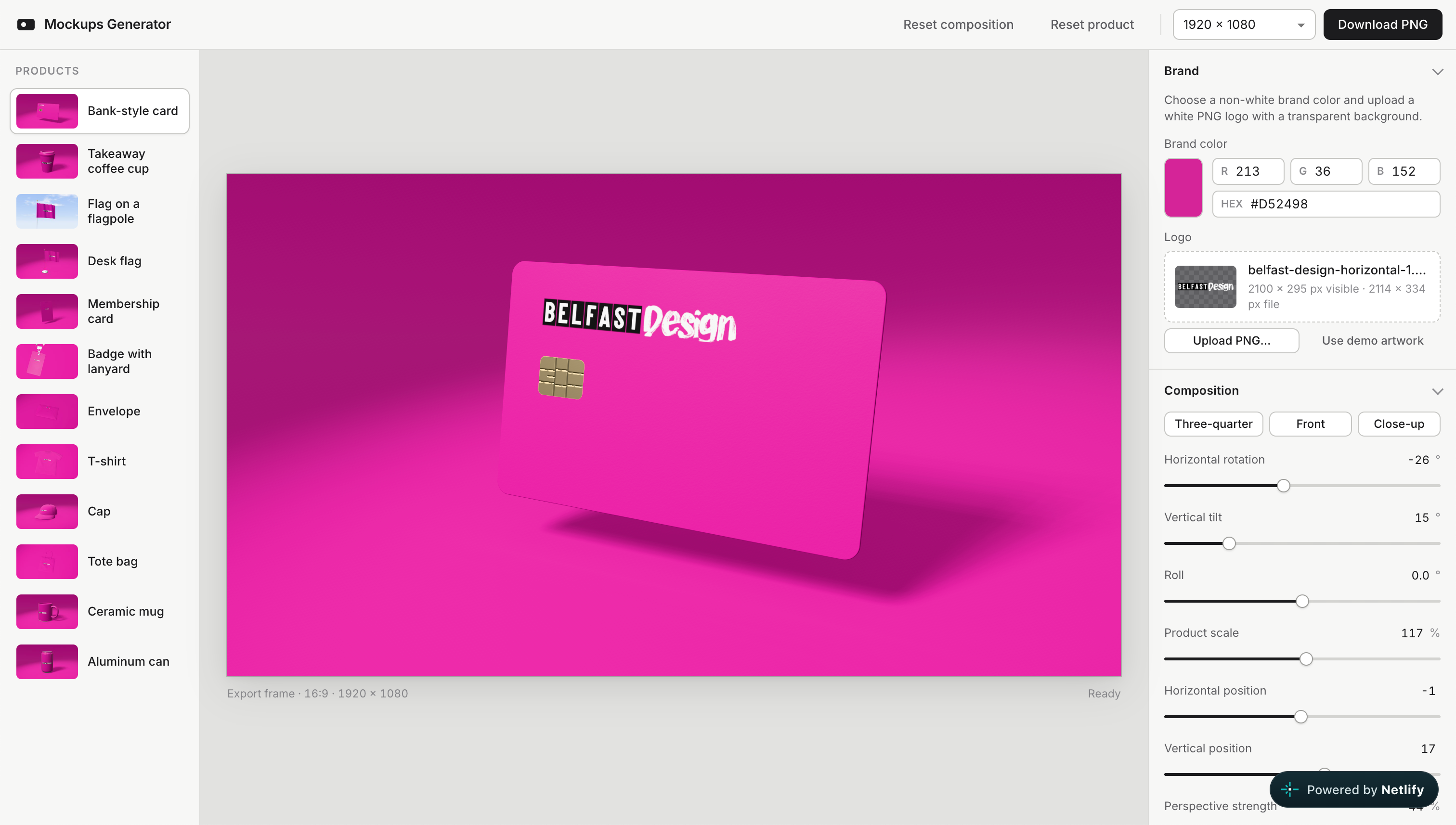
This was my first experiment in building my own design tools, and an example of what others could build for themselves. Link to the final result: https://mockups-generator-kiselev.netlify.app/
How it works
I choose a brand colour, say pink, and upload the Belfast Design logo as a PNG. All the mockups turn pink and show my logo. Then I can adjust the scene and download my mockup as a PNG.
I came up with the idea, worked through the concept with the chat, and used Claude Code to build it. To make it available through a link, I hosted it for free on Netlify. This is my first basic test tool, and I can already use it for real work.
A change in mindset
With this same process, anyone on the team can build the design tools we need. We used to think mainly about working with the tools we already had, like Adobe something. Now we can also create our own.
When we repeat the same task two or three times, we can start asking whether a small tool could do it for us. Over time, these tools become a shared collection that makes our work easier and more efficient. We can start building it today.
This article was written after the first day of the workshop at the AI + Design Summit 2026 in Brighton.